
Faking an Infinite Display Loop
Table of Contents
Introduction


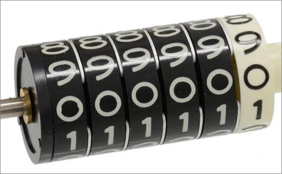
What do I mean by “an infinite display loop”? Something like the display on one cog of an odometer:
There are plenty of examples of this around the web, but many of them are far more complicated than I wanted - and in some cases, difficult (for me) to understand.
In my case, there is no actual 3-dimensional wheel and nothing is actually rotating. It’s all done by using a simple list of digits, arranged vertically and some animations which give the illusion that the list is endless (which it most definitely isn’t).
Here is a bare-bones approach:
A Vertical Strip of Digits
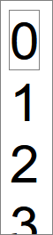
Start with a <div> containing all the digits from 0 through 9 - and with an extra 0 again at the end (explained later, below):
|
|
Because a <div> is a block-level element in HTML, the related web page will default to displaying these digits in a single column down the page.
This gives us a vertical strip of digits.
We will be sliding this vertical strip up and down to simulate the rotation of a wheel, similar to one cog of an odometer.
Showing Only One Digit
Next, we place this into one additional containing div:
|
|
We use this outermost div as the target to apply the following style:
|
|
This creates a “window” onto our strip of digits. The window is slightly higher than the height of a character (1.1em). All content outside this window is hidden (overflow: hidden;). We therefore see one digit in the window: the 0 at the top of the strip.
If you change overflow: hidden; to overflow: visible;, you will see the rest of the strip of digits, outside of our viewing window:
Animating our Strip of Digits
The next step is to slide the strip of digits up and down through the viewing window.
I use the JavaScript Web Animations API for this (WAAPI for short).
To create a continuous smooth scroll, I use the following:
|
|
The digit variable is the HTML node for <div class="digit"> - that is the HTML element we will be manipulating with our JS code.
The animate() method shown above contains two parts:
-
an array of keyframes (animation instructions). In this case, there is only one such instruction;
-
one configuration object.
The configuration object tells us that one end-to-end animation will last for a duration of 5,000 milliseconds (5 seconds), and that this will be repeated 3 times.
The keyframe in my code uses an offset value to place the instruction onto a timeline. Timelines start at 0 and end at 1 (think zero percent to 100 percent of the time assigned to the animation). So, in our case, that 1 means the transformation will begin at 0 milliseconds (by default) and last until 5000 milliseconds (it will last for 100% of the overall duration.) This gives us a fairly slow “turning of the wheel” for our digits display.
A translateY transformation moves the targeted div along its y-axis. In my case, the distance we shift is calculated elsewhere (that height variable - explained later).
This calculated height causes the div to move (slowly and smoothly) all the way to that extra <div>0</div> we have in our HTML - at the very bottom of the strip of digits.
The Never-Ending Loop Illusion
After the keyframe has finished at offset: 1, the iterations: 3 instruction means that the keyframe starts again, from its original starting position.
This instantaneous jump from the ending position (the bottom 0) back to the starting position (the top 0) is invisible to the naked eye - and this is what gives us the illusion of a never-ending reel of numbers, rotating through the visible window of our display.
To round off the above Javascript, here is how the required height of one digit is calculated:
|
|
The main point here is the use of offsetHeight to get the actual rendered height of one div containing one digit. With this info, we now know how many pixels are needed to move our strip of digits the required distance.
It’s worth noting that we could simplify this code a bit for this specific demo, where we always scroll the full length of the strip of numbers. But this approach has some flexibility when it comes to moving to any arbitrary position along the strip of numbers (as we do later on).
Demo and Code
The full source code.
The demo may be a bit out-of-date; but the source code is not.
An Animation Enhancement…
Just for fun, the above source code also contains an alternative set of animation keyframes:
|
|
Here we can see many more keyframes, spread out across the timeline (from 0 to 1, using increments of 0.05). This gives a jump effect where there is a pause between the display of each digit, as opposed to the smooth scroll used in the earlier code.
This approach uses the same visual “trick” of instantaneously jumping to the start of the number strip on each new iteration.
Simulating an Odometer
Finally, here are all of the above techniques, extended to show an odometer-style display, but using the more involved jump-style, rather than a smooth turning of the dial:
The full source code.
As with the previous demo, the demo may be a bit out-of-date; but the source code is not.